CSS radial-gradient() Function
Example
A radial gradient with evenly spaced color stops:
#grad {
background: -webkit-radial-gradient(red, green, blue); /*
Safari 5.1- 6.0 */
background: -o-radial-gradient(red, green, blue); /* Opera
11.6-12.0 */
background: -moz-radial-gradient(red, green, blue); /*
Firefox 3.6-15 */
background: radial-gradient(red, green, blue);
/* Standard syntax */
}
Try it yourself »
Definition and Usage
The radial-gradient() function creates an "image" which represents a gradient of colors radiating from the center of the gradient.
A radial gradient is defined by its center.
To create a radial gradient you must also define at least two color stops.
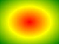
Example of Radial Gradient:
| Version: | CSS3 |
|---|
Browser Support
The numbers in the table specify the first browser version that fully supports the function.
Numbers followed by -webkit-, -moz-, or -o- specify the first version that worked with a prefix.
| Function | ||||||
|---|---|---|---|---|---|---|
| radial-gradient() | 26.0 10.0 -webkit- |
12.0 | 10.0 | 16.0 3.6 -moz- |
6.1 5.1 -webkit- |
12.1 11.6 -o- |
CSS Syntax
background: radial-gradient(shape size at position, start-color, ..., last-color);
| Value | Description |
|---|---|
| shape | Defines the shape of the gradient. Possible values:
|
| size | Defines the size of the gradient. Possible values:
|
| position | Defines the position of the gradient. Default is "center" |
| start-color, ..., last-color | Color stops are the colors you want to render smooth transitions among. This value consists of a color value, followed by an optional stop position (a percentage between 0% and 100% or a length along the gradient axis). |

More Examples
Example
A radial gradient with differently spaced color stops:
#grad {
background: -webkit-radial-gradient(red 5%, green 15%, blue
60%); /*
Safari 5.1-6.0 */
background: -o-radial-gradient(red 5%, green 15%, blue 60%); /* Opera
11.6-12.0 */
background: -moz-radial-gradient(red 5%, green 15%, blue 60%); /*
Firefox 3.6-15 */
background: radial-gradient(red 5%, green 15%, blue
60%);
/* Standard syntax */
}
Try it yourself »
Example
A radial gradient with the shape of a circle:
#grad {
background: -webkit-radial-gradient(circle, red, yellow, green); /*
Safari */
background: -o-radial-gradient(circle, red, yellow, green); /* Opera
11.6 to 12.0 */
background: -moz-radial-gradient(circle, red, yellow,
green); /* Firefox 3.6 to 15 */
background: radial-gradient(circle, red,
yellow, green);
/* Standard syntax */
}
Try it yourself »
Example
A radial gradient with different size keywords:
#grad1 {
/* Safari 5.1 to 6.0 */
background: -webkit-radial-gradient(60%
55%, closest-side,blue,green,yellow,black);
/* For Opera 11.6 to 12.0 */
background: -o-radial-gradient(60% 55%, closest-side,blue,green,yellow,black);
/* For Firefox 3.6 to 15 */
background: -moz-radial-gradient(60% 55%,
closest-side,blue,green,yellow,black);
/* Standard syntax */
background: radial-gradient(closest-side at 60% 55%,blue,green,yellow,black);
}
#grad2 {
/* Safari 5.1 to 6.0 */
background: -webkit-radial-gradient(60% 55%, farthest-side,blue,green,yellow,black);
/* Opera 11.6 to 12.0 */
background: -o-radial-gradient(60% 55%,
farthest-side,blue,green,yellow,black);
/* For Firefox 3.6 to 15 */
background: -moz-radial-gradient(60% 55%, farthest-side,blue,green,yellow,black);
/* Standard syntax */
background: radial-gradient(farthest-side at 60%
55%,blue,green,yellow,black);
}
Try it yourself »
Related Pages
CSS tutorial: CSS3 Gradients
 CSS Functions Reference